
Introduction
Mapping of geospatial data with python is really fun to work. The main library for this work is GDAL library. Perhaps, directly working with GDAL is bit complicated. we will mostly use geopandas of python. Geopandas mostly act as a wrapper. Under the hood it uses GDAL library. It also uses shapely and other GIS related packages. In addition, geopandas can handle the pandas dataframe as well.
Importing Packages
At first we will import all the packages to make a geographical map. Geopandas is the main package to make map of geospatial data.
import numpy as np
import pandas as pd
import matplotlib.pyplot as plt
import geopandas as gpd
from shapely.geometry import Point
import os
import matplotlib.gridspec as gridspec
import matplotlib.patheffects as PathEffects
from scipy.interpolate import griddata
from mpl_toolkits.axes_grid1 import make_axes_locatable
from mpl_toolkits.axes_grid1.inset_locator import inset_axes
Making point shape file from geospatial data
We will make point shape file from coordinate data. There is a parameter in each location. We will change colour of the point shape file based on that value later on. Point shapefile is saved in a variable named ‘sites’.
binpath_b = '/Users/ihasan/Downloads/Blogging/Mapping in python with geopandas/'
fn_b = os.path.join(binpath_b,'point_inf.csv')
df = pd.read_csv(fn_b)
df['Coordinates'] = list(zip(df.Long, df.Lat))
df['Coordinates'] = df['Coordinates'].apply(Point)
sites = gpd.GeoDataFrame(df, geometry='Coordinates')
Loading other shapefile directory
Addressing the geospatial data directory of the district of Bangladesh and the Forest shapefile as well. The district shapefile of Bangladesh is saved in the variable named ‘Bangladesh’ and the forest shapefile is saved in variable named ‘fr’.
sdir1 = os.path.dirname('/Users/ihasan/Downloads/Rivers of Bangladesh/Bangladesh/BGD_adm/3/BGD_adm2.shp')
sf = os.path.dirname('/Users/ihasan/Downloads/Rivers of Bangladesh/natural/natural.shp')
Bangladesh = gpd.read_file(sdir1)
fr = gpd.read_file(sf)
Making the map of geospatial data
Now we will start to plot the map. As we already have loaded the necessary shapefiles. Now plotting is not a big deal. We will do some other stuff too. Such as how to plot a subset map, how to add colorbar, how to label shapefile. Ultimate product will look like this.

Selecting partial data set
We will not plot all 64 districts. We will plot 7 specific districts and the natural forest in it. The district names are in a column of attribute table titled as ‘NAME_2’. The column name is saved in a variable named ‘cln’. The desired 7 districts names and the row number of that districts in the attribute table are saved in ‘std_a’ and ‘ids’ respectively.
cln = 'NAME_2'
std_a = ['Shatkhira', 'Khulna','Bagerhat', 'Jessore', 'Narail', 'Gopalgonj','Pirojpur']
ids = [np.where(Bangladesh[cln]==nm)[0] for nm in std_a]
ids = np.hstack(ids)
All seven districts of the main shapefiles are saved separately in variable name ‘studyar’. The plotting of that shapefile saved in a variable named ‘std_a1’. As it will be used later on.
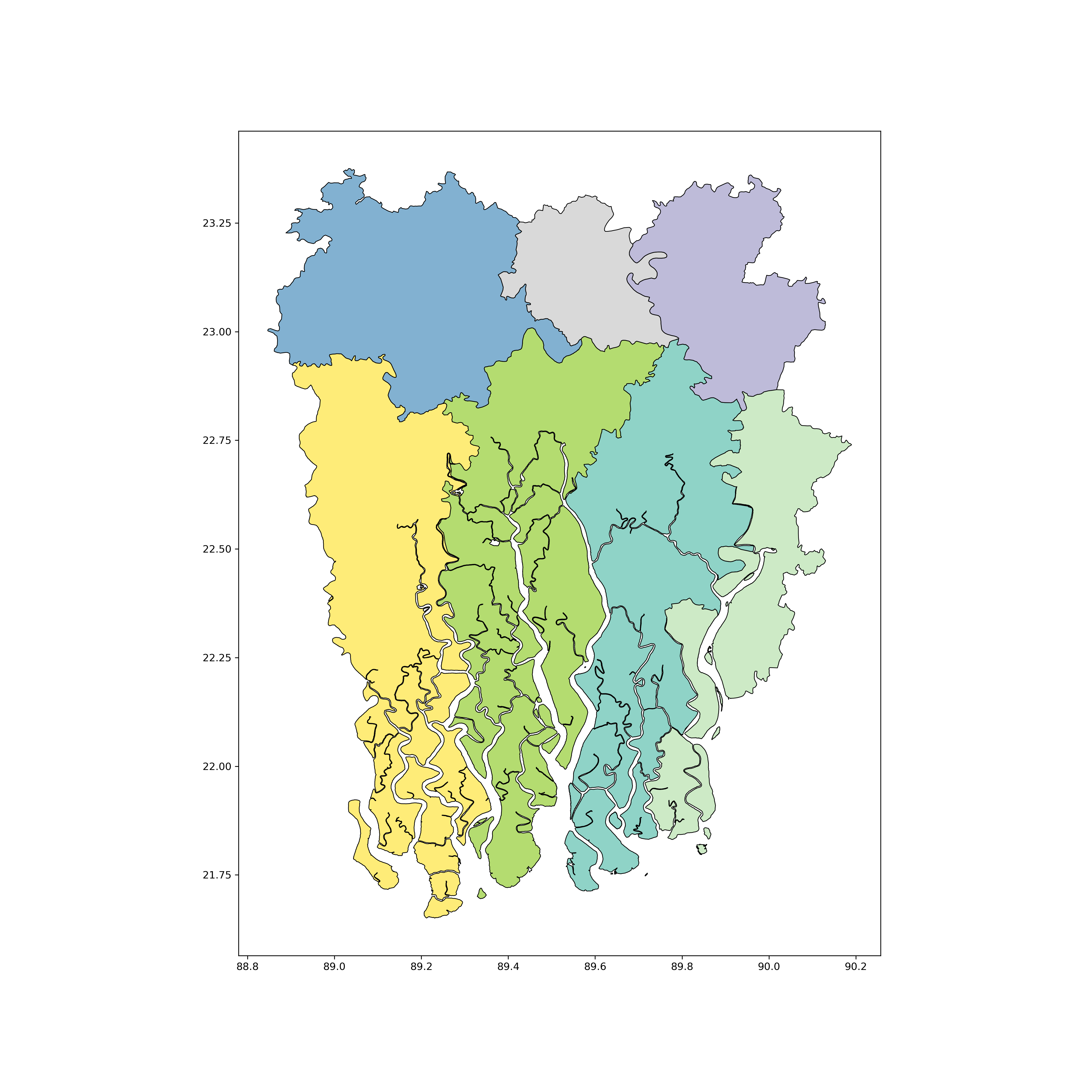
studyar = Bangladesh.iloc[ids,:]
std_a1=studyar.plot(figsize=(15,15),column=cln, cmap='Set3', edgecolor='k', lw=0.7)
The initial barebone map looks like this below.
Plotting point shapefile
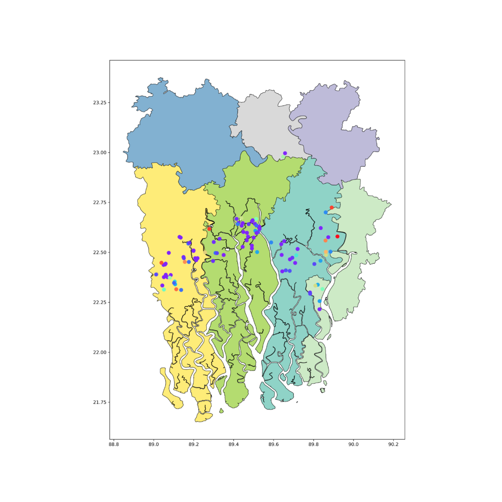
Now we will add the point shapefile that we have made earlier. The color of the point shapefile will vary according to the attribute table value of a column where a paremeter of each site was saved. The code adding point shapefile is given below.
studyar = Bangladesh.iloc[ids,:]
std_a1=studyar.plot(figsize=(15,15),column=cln, cmap='Set3', edgecolor='k', lw=0.7)
csm = sites.plot(ax=std_a1, column='RE_all', cmap='rainbow', markersize=55)
After adding the point shapefile in the previous map the map will look like this below after mapping with python.
Resizing the mapping extant
After that we will add the forest shapefile in this region. The code and map is given below.
studyar = Bangladesh.iloc[ids,:]
std_a1=studyar.plot(figsize=(15,15),column=cln, cmap='Set3', edgecolor='k', lw=0.7)
csm = sites.plot(ax=std_a1, column='RE_all', cmap='rainbow', markersize=55)
fr[fr['type']=='forest'].plot(ax=std_a1, color='g')
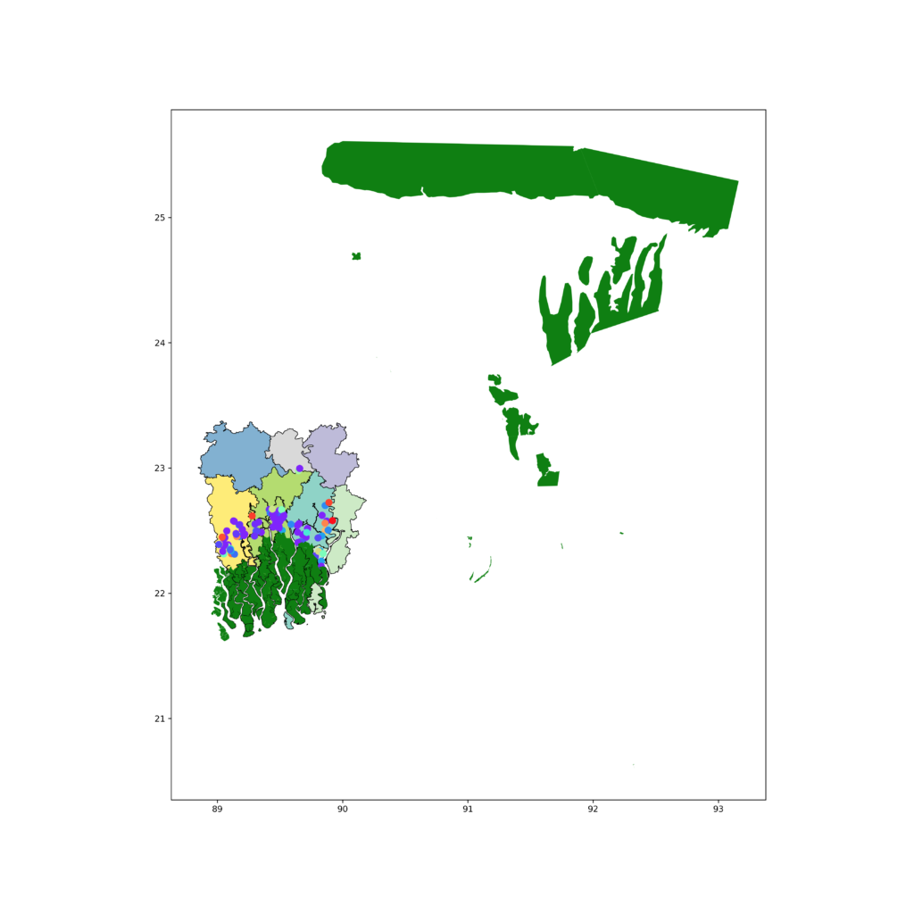
The forest shapefile has bigger extant than our study area. To resolve this we will limit x and y axis. The code and map will look like this below after limiting both axis.
studyar = Bangladesh.iloc[ids,:]
std_a1=studyar.plot(figsize=(15,15),column=cln, cmap='Set3', edgecolor='k', lw=0.7)
csm = sites.plot(ax=std_a1, column='RE_all', cmap='rainbow', markersize=55)
fr[fr['type']=='forest'].plot(ax=std_a1, color='g')
plt.xlim(88.8, 90.4)
plt.ylim(21.5, 23.5)

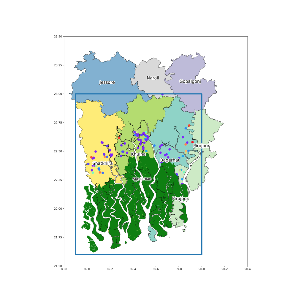
Labelling the shapefile
Now its time for labelling the shapefiles. We will label the forest and the districts as well. For forest, one label is enough. But for districts, we need a for loop. We will also make white outline to all the label text.
studyar = Bangladesh.iloc[ids,:]
std_a1=studyar.plot(figsize=(15,15),column=cln, cmap='Set3', edgecolor='k', lw=0.7)
csm = sites.plot(ax=std_a1, column='RE_all', cmap='rainbow', markersize=55)
fr[fr['type']=='forest'].plot(ax=std_a1, color='g')

tx1 = plt.text(x=89.4, y=22.25, s='Sundarban', fontsize=12)
tx1.set_path_effects([PathEffects.withStroke(linewidth=4, foreground='w')])

for idx, row in studyar.iterrows():
    fnt = 10
    txt=plt.annotate(s=row[cln], xy=(studyar.geometry.centroid.x[idx],studyar.geometry.centroid.y[idx]),
                 horizontalalignment='center', fontsize=15, wrap=True, color='k')
    txt.set_path_effects([PathEffects.withStroke(linewidth=4, foreground='w')])

plt.xlim(88.8, 90.4)
plt.ylim(21.5, 23.5)

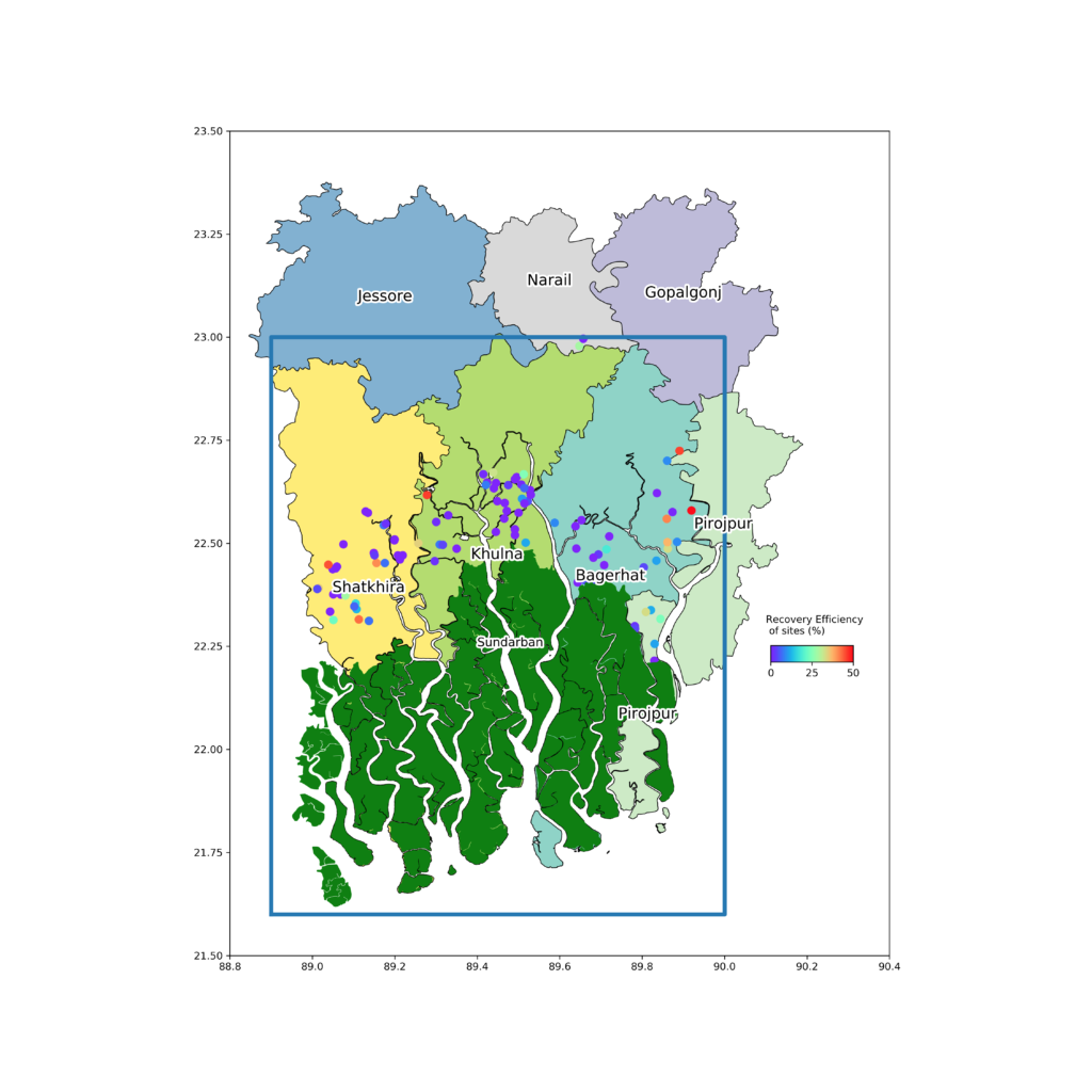
Highlighting the area of interest
We will add a rectangle to specify our area of interest.
studyar = Bangladesh.iloc[ids,:]
std_a1=studyar.plot(figsize=(15,15),column=cln, cmap='Set3', edgecolor='k', lw=0.7)
csm = sites.plot(ax=std_a1, column='RE_all', cmap='rainbow', markersize=55)
fr[fr['type']=='forest'].plot(ax=std_a1, color='g')

tx1 = plt.text(x=89.4, y=22.25, s='Sundarban', fontsize=12)
tx1.set_path_effects([PathEffects.withStroke(linewidth=4, foreground='w')])

for idx, row in studyar.iterrows():
    fnt = 10
    txt=plt.annotate(s=row[cln], xy=(studyar.geometry.centroid.x[idx],studyar.geometry.centroid.y[idx]),
                 horizontalalignment='center', fontsize=15, wrap=True, color='k')
    txt.set_path_effects([PathEffects.withStroke(linewidth=4, foreground='w')])

plt.plot([88.9, 90, 90, 88.9, 88.9],[21.6, 21.6, 23, 23,21.6], lw=4)
plt.xlim(88.8, 90.4)
plt.ylim(21.5, 23.5)
Adding colorbar
Now we will add the colour bar for the colour graduation of the point shapefile and a label to the colorbar.
studyar = Bangladesh.iloc[ids,:]
std_a1=studyar.plot(figsize=(15,15),column=cln, cmap='Set3', edgecolor='k', lw=0.7)
csm = sites.plot(ax=std_a1, column='RE_all', cmap='rainbow', markersize=55)
fr[fr['type']=='forest'].plot(ax=std_a1, color='g')

tx1 = plt.text(x=89.4, y=22.25, s='Sundarban', fontsize=12)
tx1.set_path_effects([PathEffects.withStroke(linewidth=4, foreground='w')])

for idx, row in studyar.iterrows():
    fnt = 10
    txt=plt.annotate(s=row[cln], xy=(studyar.geometry.centroid.x[idx],studyar.geometry.centroid.y[idx]),
                 horizontalalignment='center', fontsize=15, wrap=True, color='k')
    txt.set_path_effects([PathEffects.withStroke(linewidth=4, foreground='w')])

plt.plot([88.9, 90, 90, 88.9, 88.9],[21.6, 21.6, 23, 23,21.6], lw=4)
plt.xlim(88.8, 90.4)
plt.ylim(21.5, 23.5)

sm = plt.cm.ScalarMappable(cmap='rainbow', norm=plt.Normalize(vmin=df['RE_all'].min(), vmax=50))
sm._A = []
cbar_axis = inset_axes(std_a1, width='10%', height='5%',loc='lower left',
                       bbox_to_anchor=[90.1, 22.2, 2, 0.8],bbox_transform=std_a1.transData)
cbar = plt.colorbar(sm, cax=cbar_axis, orientation='horizontal', pad=0.02)
std_a1.text(x=90.1, y=22.28, s='Recovery Efficiency \n of sites (%)', fontsize=9.8)
Subset map
Now we will add a subset map of whole Bangladesh to get an idea of our position of area of interest.
studyar = Bangladesh.iloc[ids,:]
std_a1=studyar.plot(figsize=(15,15),column=cln, cmap='Set3', edgecolor='k', lw=0.7)
csm = sites.plot(ax=std_a1, column='RE_all', cmap='rainbow', markersize=55)
fr[fr['type']=='forest'].plot(ax=std_a1, color='g')

tx1 = plt.text(x=89.4, y=22.25, s='Sundarban', fontsize=12)
tx1.set_path_effects([PathEffects.withStroke(linewidth=4, foreground='w')])

for idx, row in studyar.iterrows():
    fnt = 10
    txt=plt.annotate(s=row[cln], xy=(studyar.geometry.centroid.x[idx],studyar.geometry.centroid.y[idx]),
                 horizontalalignment='center', fontsize=15, wrap=True, color='k')
    txt.set_path_effects([PathEffects.withStroke(linewidth=4, foreground='w')])

plt.plot([88.9, 90, 90, 88.9, 88.9],[21.6, 21.6, 23, 23,21.6], lw=4)
plt.xlim(88.8, 90.4)
plt.ylim(21.5, 23.5)


sm = plt.cm.ScalarMappable(cmap='rainbow', norm=plt.Normalize(vmin=df['RE_all'].min(), vmax=50))
sm._A = []
cbar_axis = inset_axes(std_a1, width='10%', height='5%',loc='lower left', bbox_to_anchor=[90.1, 22.2, 2, 0.8],bbox_transform=std_a1.transData)
cbar = plt.colorbar(sm, cax=cbar_axis, orientation='horizontal', pad=0.02)
std_a1.text(x=90.1, y=22.28, s='Recovery Efficiency \n of sites (%)', fontsize=9.8)

a=inset_axes(std_a1, width="30%", height='30%',loc='lower right')
Bangladesh.plot(figsize=(20,20), cmap='PuOr',ax=a)
a.text(x=88.6, y=22.25, s='Study Area', fontsize=9.8)
a.plot([88.9, 90, 90, 88.9, 88.9],[21.5, 21.5, 23, 23,21.5], lw=2)

Removing subset axis label and adding north arrow
For final touch, we will remove the axis tick label of the subset map, as this looks a bit mess and will add a north arrow to the map.
studyar = Bangladesh.iloc[ids,:]
std_a1=studyar.plot(figsize=(15,15),column=cln, cmap='Set3', edgecolor='k', lw=0.7)
csm = sites.plot(ax=std_a1, column='RE_all', cmap='rainbow', markersize=55)
fr[fr['type']=='forest'].plot(ax=std_a1, color='g')

tx1 = plt.text(x=89.4, y=22.25, s='Sundarban', fontsize=12)
tx1.set_path_effects([PathEffects.withStroke(linewidth=4, foreground='w')])

for idx, row in studyar.iterrows():
    fnt = 10
    txt=plt.annotate(s=row[cln], xy=(studyar.geometry.centroid.x[idx],studyar.geometry.centroid.y[idx]),
                 horizontalalignment='center', fontsize=15, wrap=True, color='k')
    txt.set_path_effects([PathEffects.withStroke(linewidth=4, foreground='w')])

plt.plot([88.9, 90, 90, 88.9, 88.9],[21.6, 21.6, 23, 23,21.6], lw=4)

std_a1.text(x=90.214-0.025, y=22.55, s='N', fontsize=30)
std_a1.arrow(90.215, 22.36, 0, 0.18, length_includes_head=True,
          head_width=0.08, head_length=0.2, overhang=.1, facecolor='k')

plt.xlim(88.8, 90.4)
plt.ylim(21.5, 23.5)

sm = plt.cm.ScalarMappable(cmap='rainbow', norm=plt.Normalize(vmin=df['RE_all'].min(), vmax=50))
sm._A = []
cbar_axis = inset_axes(std_a1, width='10%', height='5%',loc='lower left',bbox_to_anchor=[90.1, 22.2, 2, 0.8], bbox_transform=std_a1.transData)
cbar = plt.colorbar(sm, cax=cbar_axis, orientation='horizontal', pad=0.02)
std_a1.text(x=90.1, y=22.28, s='Recovery Efficiency \n of sites (%)', fontsize=9.8)

a=inset_axes(std_a1, width="30%", height='30%',loc='lower right')
Bangladesh.plot(figsize=(20,20), cmap='PuOr',ax=a)
a.text(x=88.6, y=22.25, s='Study Area', fontsize=9.8)
a.plot([88.9, 90, 90, 88.9, 88.9],[21.5, 21.5, 23, 23,21.5], lw=2)
a.set_xticks([])
a.set_yticks([])
All the data and code regarding this post can be found in the GitHub repository link below.
https://github.com/hasanbdimran/Mapping-in-python
If some one need any help or tips or assistance regarding making map with python, you are always welcome to contact me through the comment section or via email of the contact page. If you want to use my expertise on making map or geoprocessing with python, you are most welcome to visit my fiverr gig about making map and geoprocessing.
https://www.fiverr.com/hasanbdimran/make-gis-map-using-python
The main objective of this blog or the fiverr gig is to explore my knowledge and also to learn from the expert visitors on this blog.
Thanks for sharing. Keep it up and best wishes.
Thanks for reading.
Please Share the Upazilla Shape file
I have not used the upazilla shape file. Used District shape file. All files are shared in the github link. The link is also in the post. I am giving here also.
https://github.com/hasanbdimran/Mapping-in-python
Dear Mohammad Imran,
I found your blog most helpful. I had never seen a more constructive example of the spatial plotting functions of python before.
I was wondering, if perhaps you have a solution, or example, for inserting a scalebar to the plot. In most scientific institutions, the scalebar is mandatory, and it’s implementation is not trivial.
Back in python V2.x, there was the option of the Basemap. Nevertheless, the migration to cartopy still lacks some functions previously available in Basemap.
I thank you for your time, and I hope hearing from you soon.
Sincerely,
Thanks for your kind words. I have done some coding regarding on scale bar. But those are totally manual process. I will make those examples like general functions so that others can use and post on my blog soon.