
Introduction
Statice plots works most of the cases. However, there are cases, we want to interact with our plots. In addition, in some cases, we also want that, end user can interact with the plots. So, todays topic is interactive data visualisation. There are a lot of good library available in python for interactive data visualisation. Plotly library is one of them. With Plotly, you can also make interactive geographic map.
We will also use Cufflinks. It works as a connector between the Pandas library and Plotly. It helps us plot interactive graphs directly using a Pandas dataframe. So, If your are familiar with pandas dataframe, then you have leaned 50% of plotly. This is the benefits of using cufflinks. Otherwise, plotly’s native code is bit complicated.
Installation
Installation of Plotly is easy. First, install plotly. After that, install Cufflinks. Don’t install plotly after installation of Cufflinks. Because, Cufflink’s support for updated version of plotly might not released yet. The installing command are given below.
$ pip install plotly
$ pip install cufflinks
Importing libraries
import seaborn as sns
import pandas as pd
import matplotlib.image as mpimg
import os
import plotly.graph_objs as go
import numpy as np
import cufflinks as cf

from plotly.offline import download_plotlyjs, init_notebook_mode, plot, iplot
init_notebook_mode(connected=True)
cf.go_offline()
We will import seaborn for dataset, pandas and numpy for data handling, matplotlib for image data handling and lastly, plotly and cufflinks. We will use plotly as offline mode.
Plotly is actually an online library. It hosts your data visualisations. Perhaps, it also provides an offline mode that can be used to draw interactive plots offline. For offline interactive mode to work properly inside the jupyter notebook, we need to import the download_plotlyjs, init_notebook_mode, plot, iplot from plotly.offline .
The main dataset for plotly library
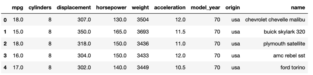
dataset = sns.load_dataset('mpg')
dataset.head(5)
Most of the interactive plot will be made based on the dataset name ‘mpg’ from seaborn library. We will work on other dataset along the way later. The first 5 row the dataset is given below.
Static plot with pandas
Before interactive plots, we will plot our data with Pandas static graphs. Let’s call the plot() method on our dataframe for the static graph to observe data the data and remind ourself with the pandas simple plot method. Because, with cufflinks bindings, interactive command works the same way with the pandas dataframe. Perhaps We will plot the values for the 'mpg', 'cylinders', 'acceleration' columns. The code looks like below.
dataset2=dataset[['mpg','cylinders','acceleration']]
dataset2.plot(figsize=(10,5));

Interactive plots (line) with plotly library
Now we will do the interactive plots using Plotly. To plot interactive plots using Pandas dataframe, we simply need to call the iplot() method instead of the plot method. Take a look at the following code.
dataset2.iplot()
After the simulation of above code, you will see an interactive line plot for the 'mpg', 'cylinders', 'acceleration' columns as the figure below.
Output:
Now, If you hover your mouse cursor over the plot you should see values. In addition, you can zoom in and zoom out. Moreover, you can also add and remove columns from the plot. Finally, you can also save the graph as a static image.
In today’s discussion, we will plot some of the most commonly used interactive plots using Plotly.
Bar Chart in plotly library
Regular Bar Chart
Interactive plotting in plotly can be done by iplot() function. For bar plot you need to pass “bar” as the value for the kind parameter of the iplot() function. In addition, you need to pass the list of the columns for which you want to plot graphs to the x attribute. Lastly, the y attribute is passed. The following script plots a bar plot for the origine and cilinders columns on the x-axis and mpg on the y-axis.
dataset.iplot(kind='bar', x=['origin','cylinders'], y='mpg')
Output:
You can see from the output that four bars have been plotted for the total bill. The bars show all possible combinations of sum values for origin and cylinders columns.
Bar Char of Mean
You can also call an aggregate function e.g. (mean) on the Pandas dataframe and then call the iplot() function and pass “bar” as the value for kind attribute. For our case, if you want to plot the bar plot containing the average values for mpg, cylinders and acceleration column, you can use the following script:
dataset2.mean().iplot(kind='bar')
Output:
In the output, if you hover your mouse on the bar plots, the mean values for mpg, cylinders and acceleration will appear.
Horizontal bar chart
In addition to vertical bar chart, you can also do the horizontal bar chart. You just have to pass the “barh” instead of “bar” value for the kind attribute. The following code will do the vertical bar plot.
dataset2.mean().iplot(kind='barh')
Output:
Scatter plot by plotly library
Plotly also has the most common scatter interactive plot option. You just need to pass the “scatter” as a value for the kind parameter of the iplot() function. In addition, you also need to pass column names for the x and y-axis. The next script below will plot a scatter plot for the displacement column on the x-axis and horsepower column in the y-axis.
dataset.iplot(kind='scatter', x='displacement', y='horsepower',
              mode='markers', xTitle='Displacement', yTitle='Horsepower')
Output:
Now, if you hover your mouse on the plot, x,y value will appear on the screen.
Box plot by plotly library
Plotly library also has the interactive box plot option. You just have to simply pass the box as value for the kind parameter of the iplot() function.
dataset2.iplot(kind='box')
Output:
If you hover you mouse on the box plot, you will see max, min, median, q1, q3.
Histogram plot
You can also use plotly library for interactive histogram plot. You just need pass the “hist” as the value for the kind attribute of the iplot() method. If you want to plot the histogram for the “mpg” column of the data, the next script will do the plot.
dataset['mpg'].iplot(kind='hist',bins=25)
Output:
Scatter matrix plot
The scatter matrix plot is actually a set of common interactive plot plotted all together as a matrix. The code below is for the interactive scatter matrix plot.
dataset2.scatter_matrix()
Output:
Spread plot
The plotly library also has the option to plot interactive spread plot. The spread plot gives the spread between two or more than two numerical columns at any particular point. For example, to see the spread between horsepower and mpg, you can use the spread function as below:
dataset[['mpg','horsepower']].iplot(kind='spread')
Output:
3D plot in plotly library
Plotly library has also the ability to create 3-D interactive plots. For example, to see 3D plot for mpg, cylinders and acceleration columns, the following code will do the work.
dataset2.iplot(kind='surface',colorscale='rdylbu')
Output:
Heatmap plot
There is also an interesting interactive heatmap plot option in plotly library. We just need to pass the “heatmap” as a value to the kind attribute of the iplot() method. The code for heatmap plot is given below.
df = pd.read_csv('https://raw.githubusercontent.com/plotly/datasets/master/volcano.csv')
df.iplot(kind='heatmap',colorscale='spectral')
Output:
Image plot with heatmap
Plotly’s latest release has the option to plot interactive image. But, the problem is, cufflinks latest release, still doesn’t support the latest version of plotly. Older version of plotly, doesn’t have the option to plot image. But there is a way around. We can plot single band image using heatmap option of plotly. The image may not exactly look like the actual image, as we are not using all 3 band of RGB. The script of plotting image with heatmap option is given below. Github link of all project file and all script will be given at the end of the tutorial.
url = 'https://github.com/hasanbdimran/Plotly-libray-tutorial-with-cufflinks/blob/master/myAvatar_rz.png?raw=true'
image = mpimg.imread(url)
test_image=image.copy()[:,:,0].T
test_image=test_image[:,::-1]
df_im = pd.DataFrame(test_image)
df_im.iplot(kind='heatmap',colorscale='-ylgnbu')
Output:
Geographic Map with plotly library
Interactive geographic map is a very important feature of plotly library. But geographic map can not be done with cufflink support. So, we have to do it with, native plotly language. For this we have to import the plotly library offline without cufflink support. The code is given below.
import plotly.plotly as py
import plotly.graph_objs as go
from plotly.offline import download_plotlyjs, init_notebook_mode, plot, iplot

init_notebook_mode(connected=True)
import pandas as pd
1. Map data dictionary
First step to make a geographic map is to create a map data dictionary. This data dictionary will include the information of the map type, location, location mode, colorscale, text, z, colorbar. Example of a map dictionary is given below.
map_data = dict(type='choropleth',
            locations=['MI', 'CO', 'FL', 'IN'],
            locationmode='USA-states',
            colorscale='Portland',
            text=['Michigan', 'Colorado', 'Florida', 'Indiana'],
            z=[1.0,2.0,3.0,4.0],
            colorbar=dict(title="USA States")
           )
2. Map layout
The second step is to create a map layout dictionary. This dictionary will include the information about whole map location layout. For our example case, the layout dictionary is given below.
map_layout = dict(geo = {'scope':'usa'})
3. Graph object
If you look at the section where we imported the libraries, we imported the plotly.graph_objs class. The third step is to create an object of this graph. The object takes two parameters: data and layout. We will pass our map data dictionary to the first parameter and the map layout dictionary to the second parameter. the code is given below.
map_actual = go.Figure(data=[map_data], layout=map_layout)
4. Calling iplot() method
The last step is to call the iplot() function and pass it the graph object that we have created in the third step. The code is given below.
iplot(map_actual)
Output:
In the map above, you will see the geographic map for four US states. You will also see that, other states are empty, as their corresponding information has not been provided. If you hover the mouse over the colored states, you will see the corresponding values of the text and z keys that is specified in data dictionary.
Geographical choropleth US map
Now we have a basic idea about how to plot interactive geographical map by plotly library. We will apply our knowledge and make a choropleth US map based on the total agricultural export of each states. The data and the script can be found on the plotly’s can be found on ploty’s documentation website.
dft5 = pd.read_csv('https://raw.githubusercontent.com/plotly/datasets/master/2011_us_ag_exports.csv')
dft5.head()
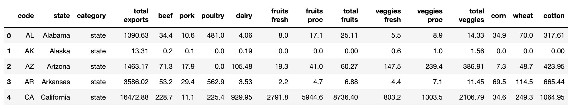
The code below will produce the interactive geographical choropleth US map based on agricultural exports. In map data map type is ‘choropleth’. locations is selected from the dataframe column ‘code’ of state. locationmode is ‘USA-states’. text parameter taken to pass the names of the states from the dataframe column ‘state’. The main information z is taken from the ‘total exports’ column of the dataframe.
map_data = dict(type='choropleth',
            locations=dft5['code'],
            locationmode='USA-states',
            colorscale='YlGnBu',
            text=dft5['state'],
            marker=dict(line=dict(color='rgb(255,0,0)', width=2)),
            z=dft5['total exports'],
            colorbar=dict(title="Total exports <br> Millions USD")
           )
map_layout = dict(title='USA States Agricultural exports of 2011',
              geo=dict(scope='usa',
                         showlakes=True,
                         lakecolor='rgb(85,173,240)')
             )
map_actual = go.Figure(data=[map_data], layout=map_layout)
iplot(map_actual)
Output:
Geographical choropleth world map
Now we will plot choropleth map of world GDP. The GDP data is collected from plotly’s documentation website. Basic steps are the same as above. The GDP data is loaded first by pandas.
dfw = pd.read_csv('https://raw.githubusercontent.com/plotly/datasets/master/2014_world_gdp_with_codes.csv')
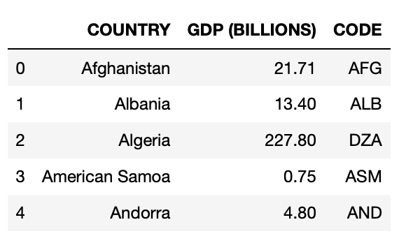
The code below will execute the choropleth world map based on GDP. In map_data dictionary locations is loaded from dataframe column of ‘CODE’. locationmode is ‘ISO-3’ for the world map. Overall there are three types of locationmode available ‘country names’, ‘ISO-3’ and ‘USA-states’. text is loaded from ‘COUNTRY’ column of the dataframe. The main GDP data is passed in z from the dataframe column of ‘GDP (BILLIONS)’. In the map_layout the scope is set to ‘world’. Rest of the code is self explanatory.
map_data = dict(type='choropleth',
            locations=dfw['CODE'],
            locationmode='ISO-3', # country names, ISO-3, USA-states
            colorscale='YlGnBu',
            text=dfw['COUNTRY'],
            marker=dict(line=dict(color='darkgray', width=0.5)),
            z=dfw['GDP (BILLIONS)'],
            colorbar=dict(title="GDP<br>Billions US$")
           )
map_layout = dict(title='2014 Global GDP',
              geo=dict(scope='world',
                         showlakes=True)
             )
map_actual = go.Figure(data=[map_data], layout=map_layout)
iplot(map_actual, show_link=True)
Output:
Concluding remarks
The interactive plotting library plotly is very strong library. In addition, cufflinks support for pandas makes it very efficient. Most of the plot here is based on cufflink supported code except the geographic map part. There are also very interesting tutorial available on the internet. As for example, I have learned plotly following plotly documentation and a blog post. All the link is given below.
Plotly open source library
Another interesting blogpost on plotly
https://stackabuse.com/using-plotly-library-for-interactive-data-visualization-in-python/
Github repository link
https://github.com/hasanbdimran/Plotly-libray-tutorial-with-cufflinks